
One of my hobbies is researching my family tree; I enjoy learning about where I’ve come from as well as reading about how my relatives lived in centuries past. I was recently fortunate enough to come into possession of a 200-page family history written in the late 1970s, and after I finished reading and digitizing it, I wanted to see what data and trends I could extract from my now 2,500-person-strong family tree, so I started writing a collection of PHP scripts aimed at reading and manipulating GEDCOM files. (GEDCOM is the defacto standard for digital family tree files, and it is used by essentially all family tree software.) The scripts are open source and available via Github in my PHP GEDCOM Tools repository.
I downloaded my family tree from Ancestry.com in GEDCOM format and got started. First things first: I generated a second GEDCOM file containing only the people that are related to me by blood. This isn’t strictly necessary, but I prefer to limit the results to my genetic relatives.
./export-related.php --gedcom=Everyone.ged --person='Christopher Finke' --out=Related.gedAfter I had a tree with all in-laws removed, I started with something simple: gender breakdown.
./gender-counts.php --gedcom=Related.ged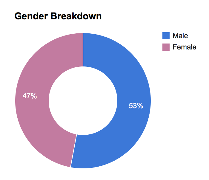
53/47% male/female split. Not that interesting, and possibly skewed by incomplete data. How about something more personal, like name choices?
./name-histogram.php --gedcom=Related.ged --histogram=cloud-raw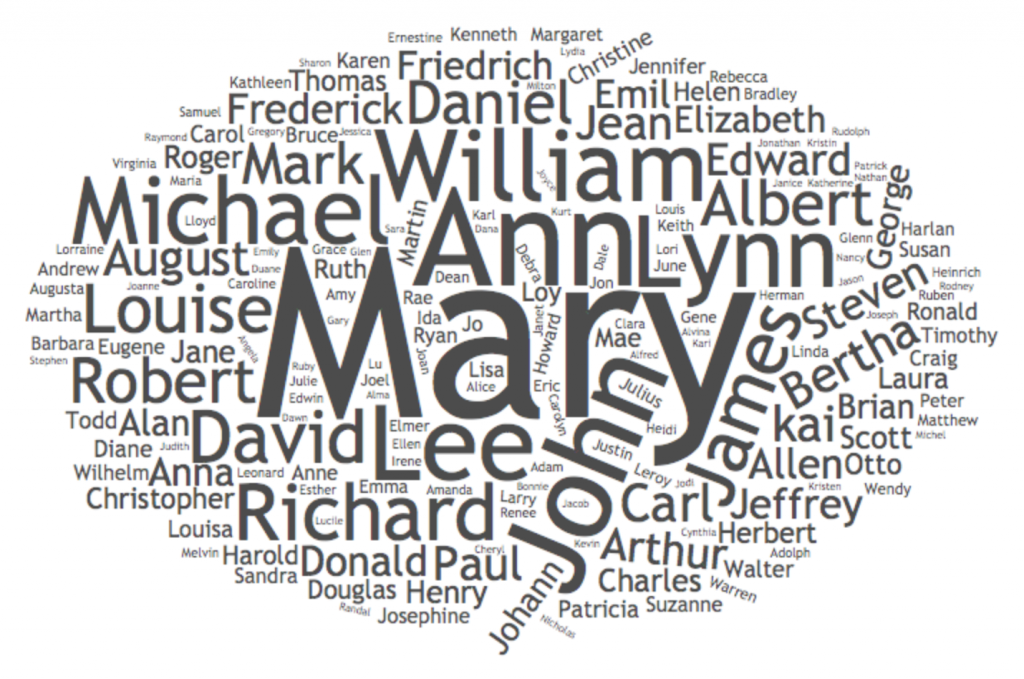
(The image was generated by pasting the command output into the tool at http://timc.idv.tw/wordcloud/)
That’s kind of neat. Women are outnumbered, but they teamed up to make “Mary” the most common given name. “John” and “William” were close behind. “Melvin” brought up the rear.
Does my family line favor any of the months for giving birth?
./date-histogram.php --gedcom=Related.ged --type=BIRT --specificity=month --histogram=counts(This and other charts were generated by pasting the command output into a Google Docs spreadsheet and using that data to create the image).
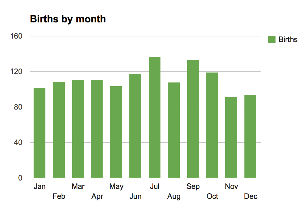
September and July have little (baby) bumps, but births are pretty uniform across the board. The same chart for deaths is a little more interesting though.
./date-histogram.php --gedcom=Related.ged --type=DEAT --specificity=month --histogram=counts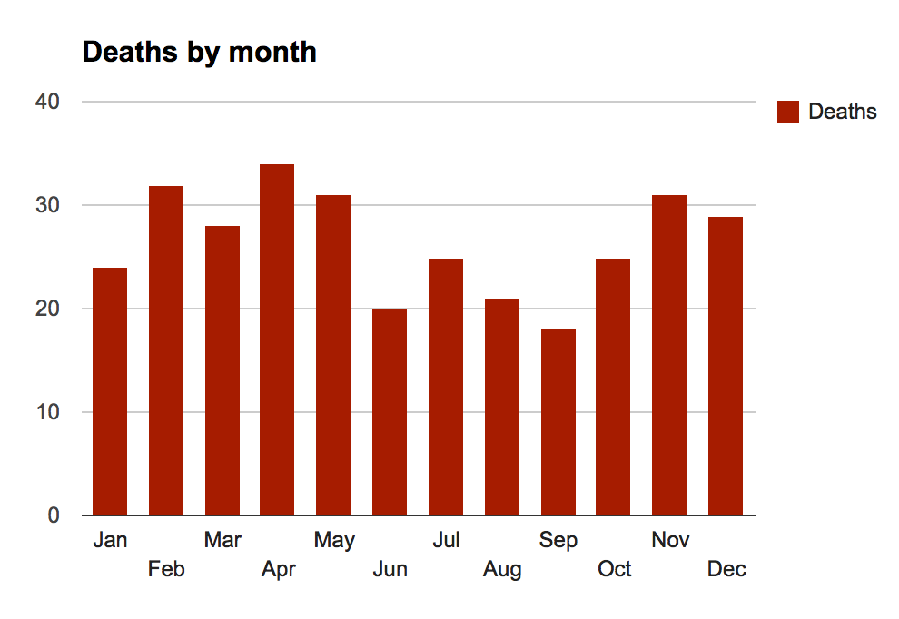
A little more variation — deaths seem to be less common in the summer months, but no month really takes more than its fair share of lives. September has the best net gain for life, since it produced lots of babies and the fewest deaths. You go, September!
How about marriage? Is June really the most popular month for weddings, as is often assumed?
./date-histogram.php --gedcom=Related.ged --type=MARR --specificity=month --histogram=counts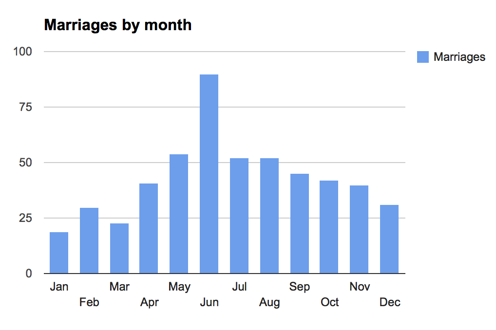
Well, yeah.
How old are those lovebirds when they tie the knot?
./age-histogram.php --gedcom=Related.ged --type=MARR --histogram=counts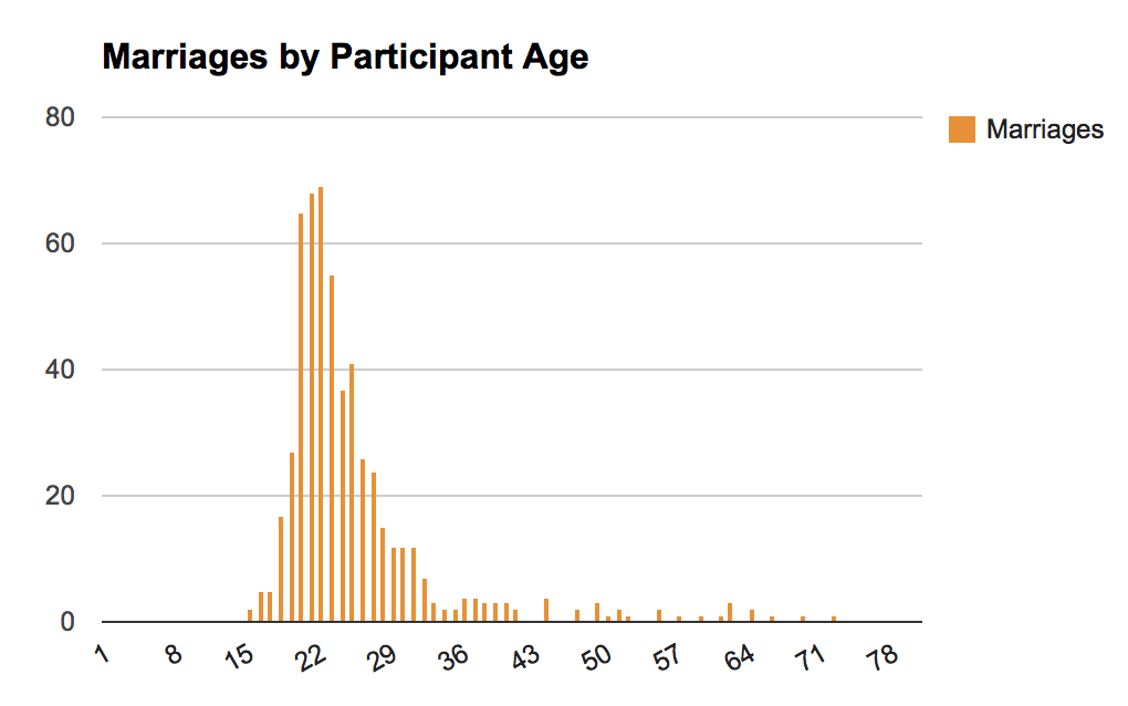
Across my entire recorded family history, the most common time to get married has been between the ages of 20 and 25; the median marriage age is 23.
How many children do those married couples end up having?
./child-count-histogram.php --gedcom=Related.ged --histogram=counts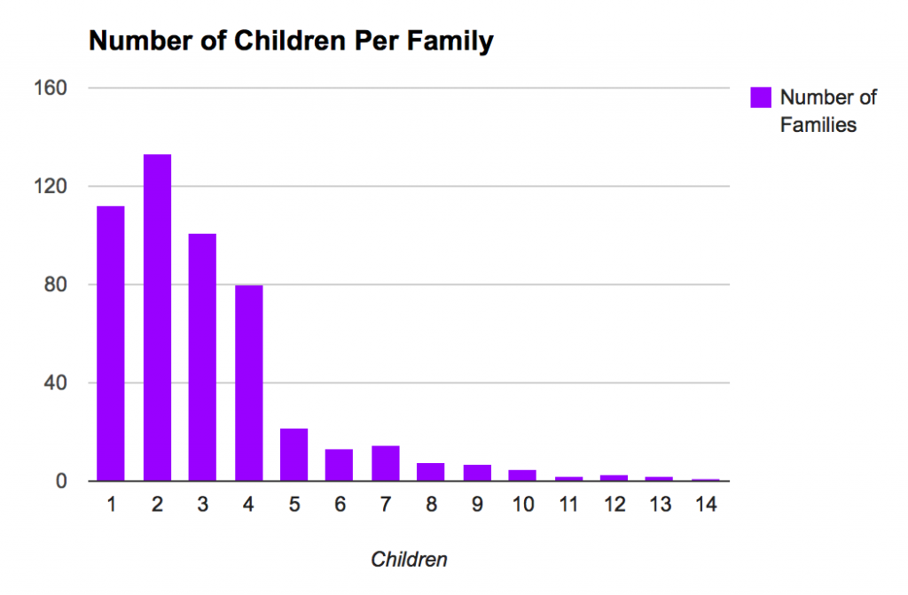
There’s a steep dropoff after the fourth child, and I’m not surprised. As Jim Gaffigan said, “If you want to know what it’s like to have a fourth, just imagine you’re drowning, and then someone hands you a baby.”
Death comes to all, but when??
./death-age-stats-over-time.php --gedcom=Related.ged --timeframe=decade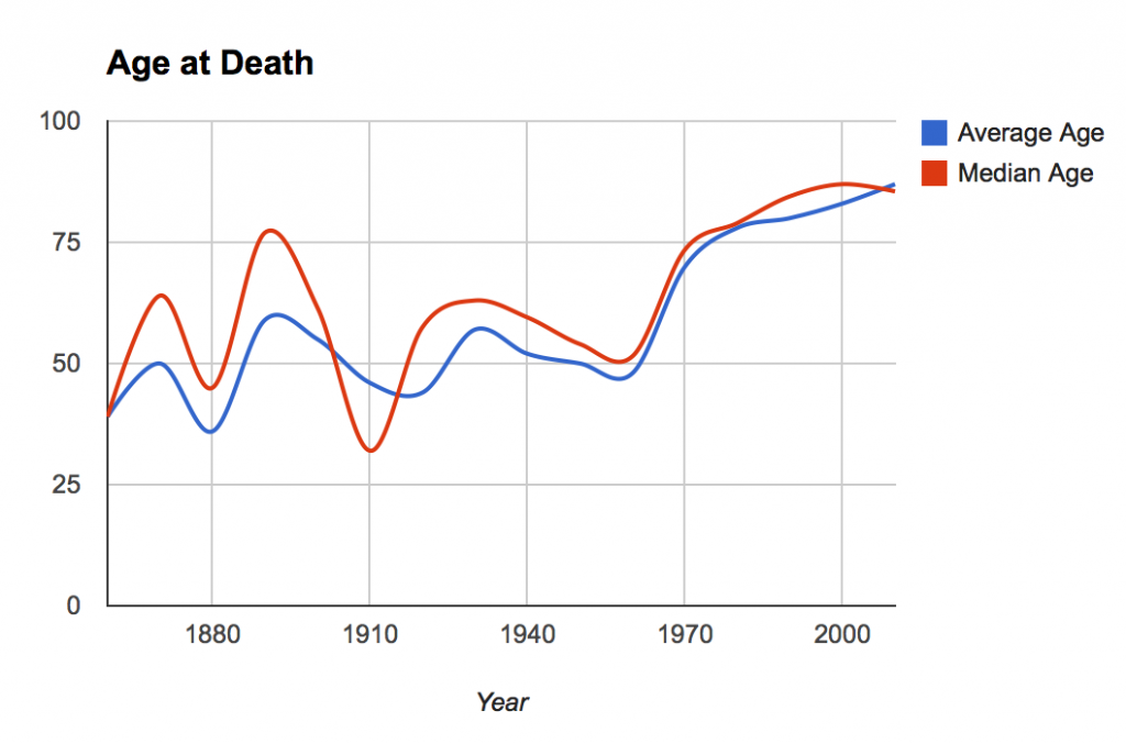
You can see that over the last 50 years, my family’s median and average age at death has been slowly rising. That’s good news for me, right? (Early numbers are pretty jumpy due to a lower sample size and frequent stillbirths.)
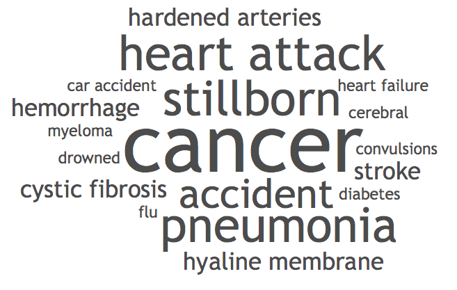
How did these people die? Does any cause of death stand out?
./death-note-histogram.php --gedcom=Related.ged --histogram=cloud-rawMost causes of deaths weren’t known or mentioned, but for those that were, cancer was at the top of the list.
Where were my ancestors born? Can I see my family spread across the country as sons and daughters move away and start their own families?
./place-progression.php --gedcom=Related.ged --type=BIRT --out=birth-places.gif --key=[Google API key] --icon=[URL of icon mask] --start_year=1860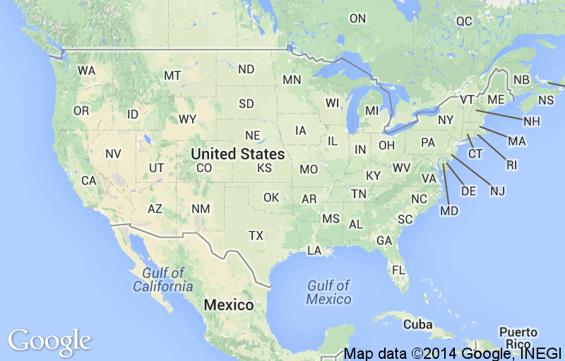
I can! You can literally see my family spread like an outbreak of measles. (Note that this GIF begins in the year 1860 when my ancestors first began arriving from Europe.)
If you want to investigate your own family tree, grab a copy of the scripts and see for yourself. If you have ideas for any other interesting stats that could be gleaned from family trees, leave them in the comments and I’ll add some more scripts to the repository.
Is that a relative from San Diego I see!?
You know it. Shout out to my third cousins Christopher and Kevin, representing San Diego!
You’ve got the data; now write the stories.
Thanks very much for the class, it worked well for a small project I was working on. One problem I found on my data was that the header ended up including the first Individual, so I had to set the last id to HEAD at the start.
I am sure it’s not the right way, but my php is not very strong.
Could you overlay the cause of death and place of death onto a pedigree chart to trend the diseases? You could then even see clusters of causes of death- for instance, if you knew that several generations of family all lived in WV and worked as miners, you may see them dying of different lung diseases. Then you may be able to see what could have been passed down, and what was environmental.
That’s a really cool idea. I’m definitely going to try it when I get the time; I’ll post a followup when I do.
I’ve done similar things with my family tree at https://genealogy.nigelhorne.com/cgi-bin/page.fcgi?page=graphs
It’s interesting to see the similarities and differences with your results. Thank you for your article.
Very interesting, thanks for the link!
I’ve just started researching doing something similar with my tree as you’ve done with the map, but I’d like to include europe and to remove the circles as someone dies (my tree goes back to 90 ad, I’m sure not all is legit, but I’d love to see an animation of the spreading of that many years!) Any advice? I’m not a coder, but I’m stubborn.
I think to include Europe, you’d edit line 111 of place-progression.php and change “United+States” to a latitude/longitude pair that is midway between the furthest places you want to include in your map. You’d probably have to adjust the zoom, size, and scale parameters too.
Removing dots after people die is tricky. The tool currently works by layering the dots for each year on top of each other, and continuing to show all dots for previous years. You’d have to modify the tool to replace the current set of dots each year with only dots from living people (which is also some work to determine), and after looking through the code, it wouldn’t be straightforward.